Component Library
Next JS
TypeScript
Tailwind
Figma
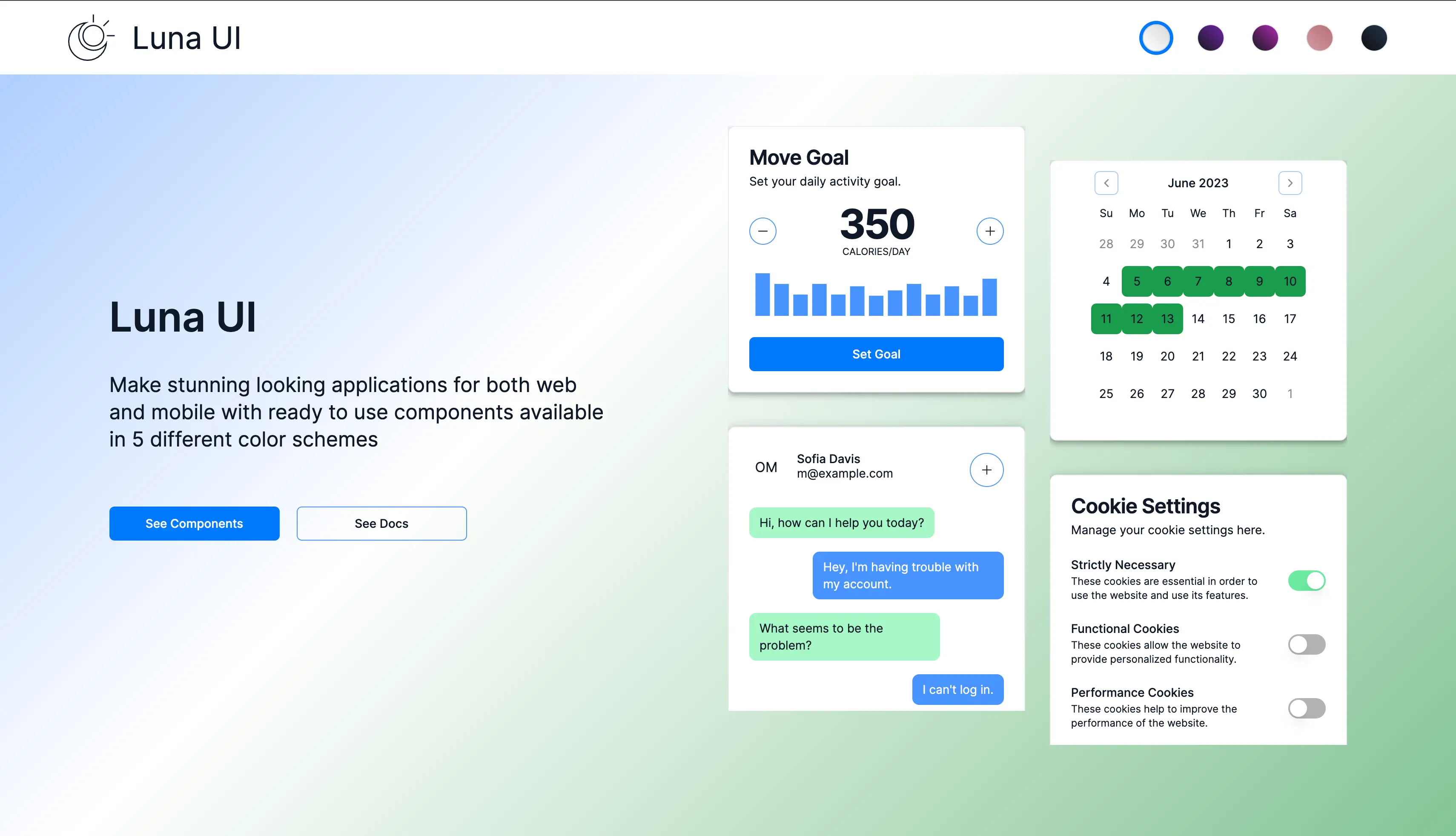
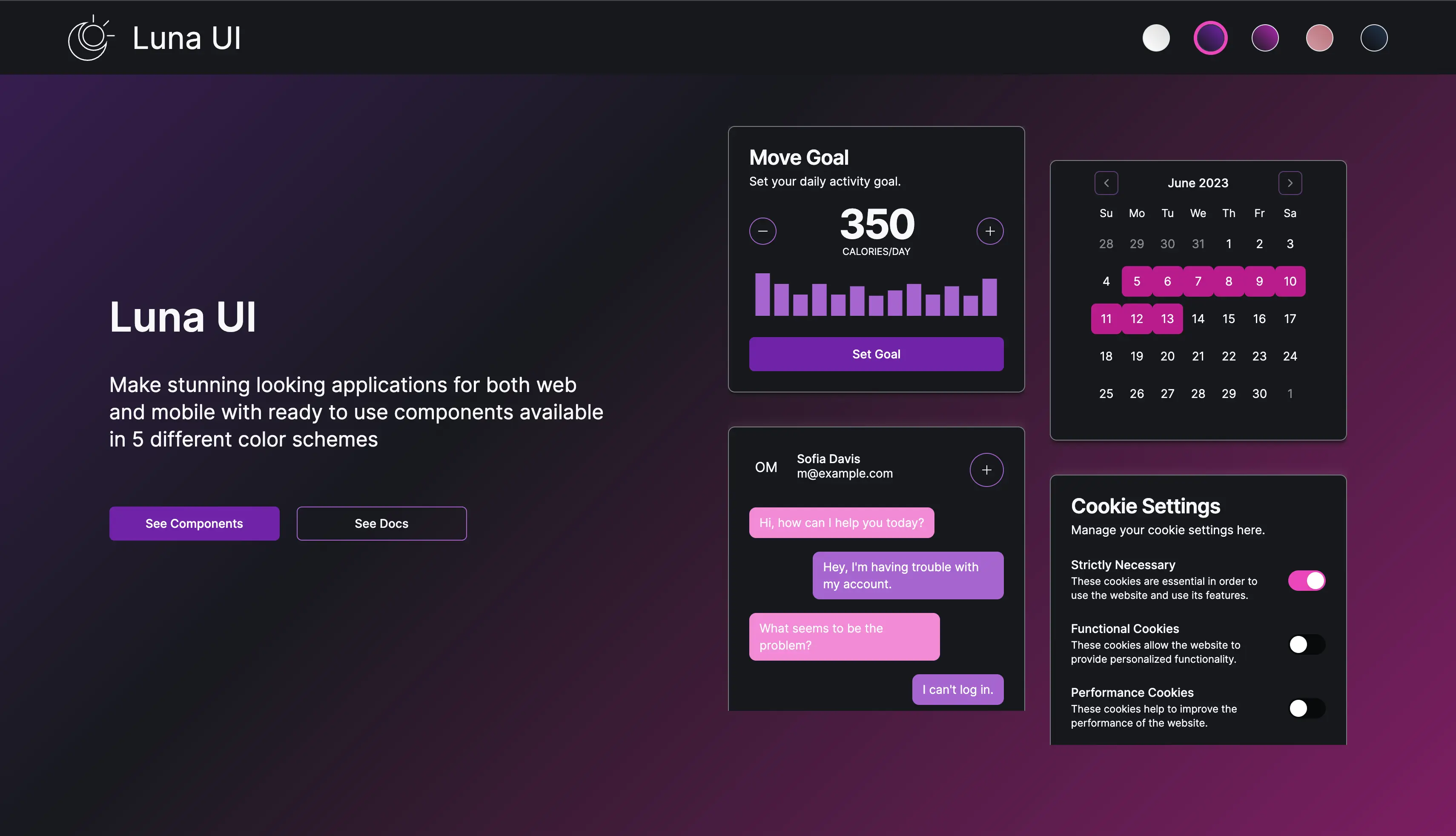
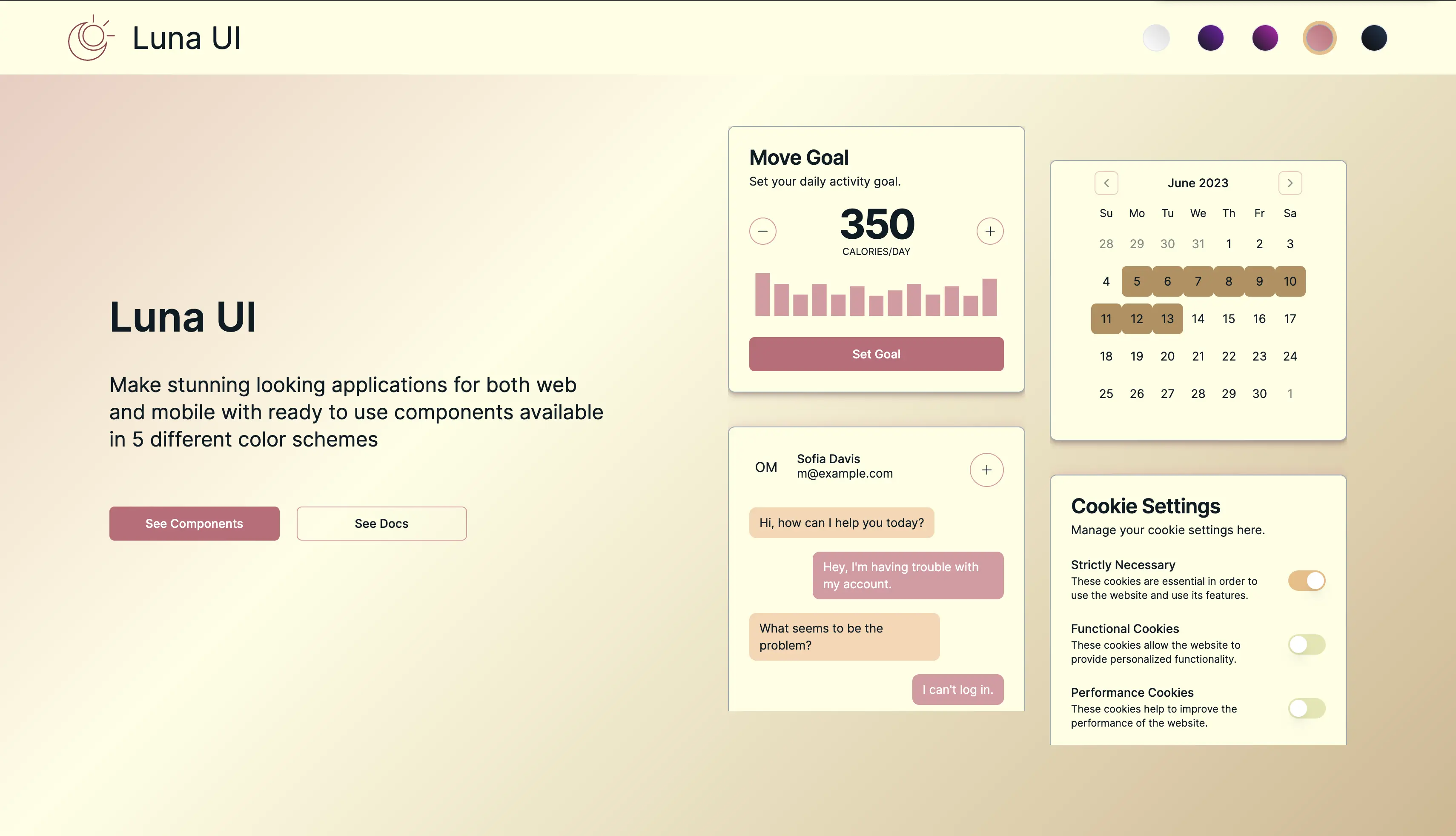
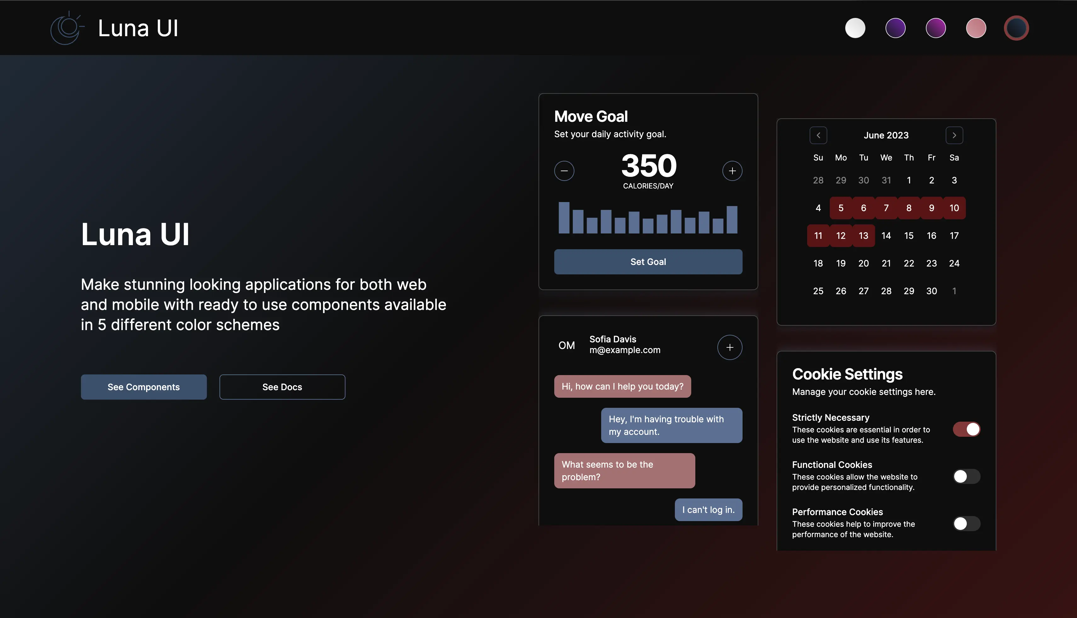
This custom component library is designed to enhance development efficiency and consistency across React-based frameworks, including React Native. Built on top of ShadCN, it provides a seamless developer experience with a well-structured, highly customizable set of UI components. Engineered with Next.js and TypeScript, the library ensures type safety, scalability, and optimal performance. Tailwind CSS is leveraged for rapid styling and design flexibility, allowing developers to effortlessly customize components while maintaining a cohesive aesthetic. Additionally, the library offers five distinct color themes, enabling seamless adaptation to various brand identities and design preferences. All components are meticulously crafted in Figma before implementation, ensuring pixel-perfect design consistency and an intuitive user experience. This library serves as a powerful foundation for building modern, visually appealing, and highly functional React applications.